
West Bengal State University Prospectus: Editorial and Information Design
A multi-department academic prospectus transformed from raw institutional content into a clear, credible and professionally structured publication.

Project Snapshot
- Client: West Bengal State University
- Sector: Public higher education
- Gateway Graphics role: Content structuring, visual storytelling consultancy and prospectus design
- Audience: Prospective students, parents, departments and institutional stakeholders
- Output: A unified academic prospectus for print and institutional communication
The Communication Challenge
Academic information was distributed across multiple departments and arrived in different formats. Programme structures, course details, eligibility information and departmental profiles needed to become one publication without losing accuracy or institutional seriousness.
The prospectus required a consistent editorial flow, a clear navigation system and a visual language that could serve first-time readers as well as academic stakeholders.
Our Role Extended Beyond Page Design
Gateway Graphics worked as an editorial and information-design partner. Content was collected department by department, reviewed for consistency, organised into a logical sequence and then translated into a repeatable page system.
- Department-wise data and content coordination
- Editing and standardisation of supplied information
- Publication architecture and content sequencing
- Typographic hierarchy and page navigation
- Colour system and repeatable departmental layouts
- Print-ready prospectus design and production support
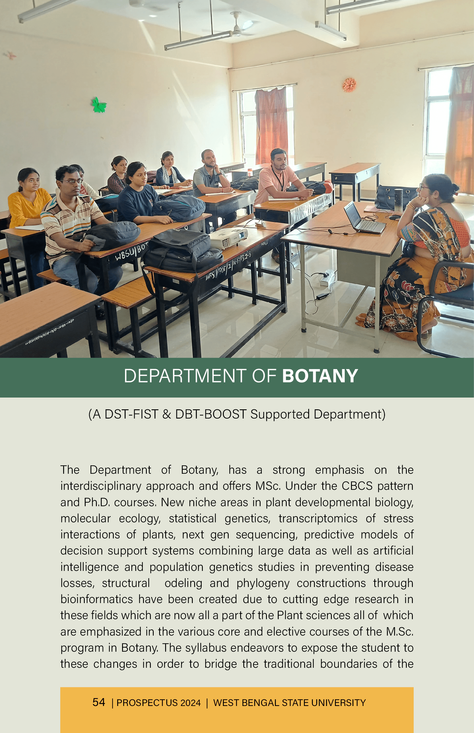


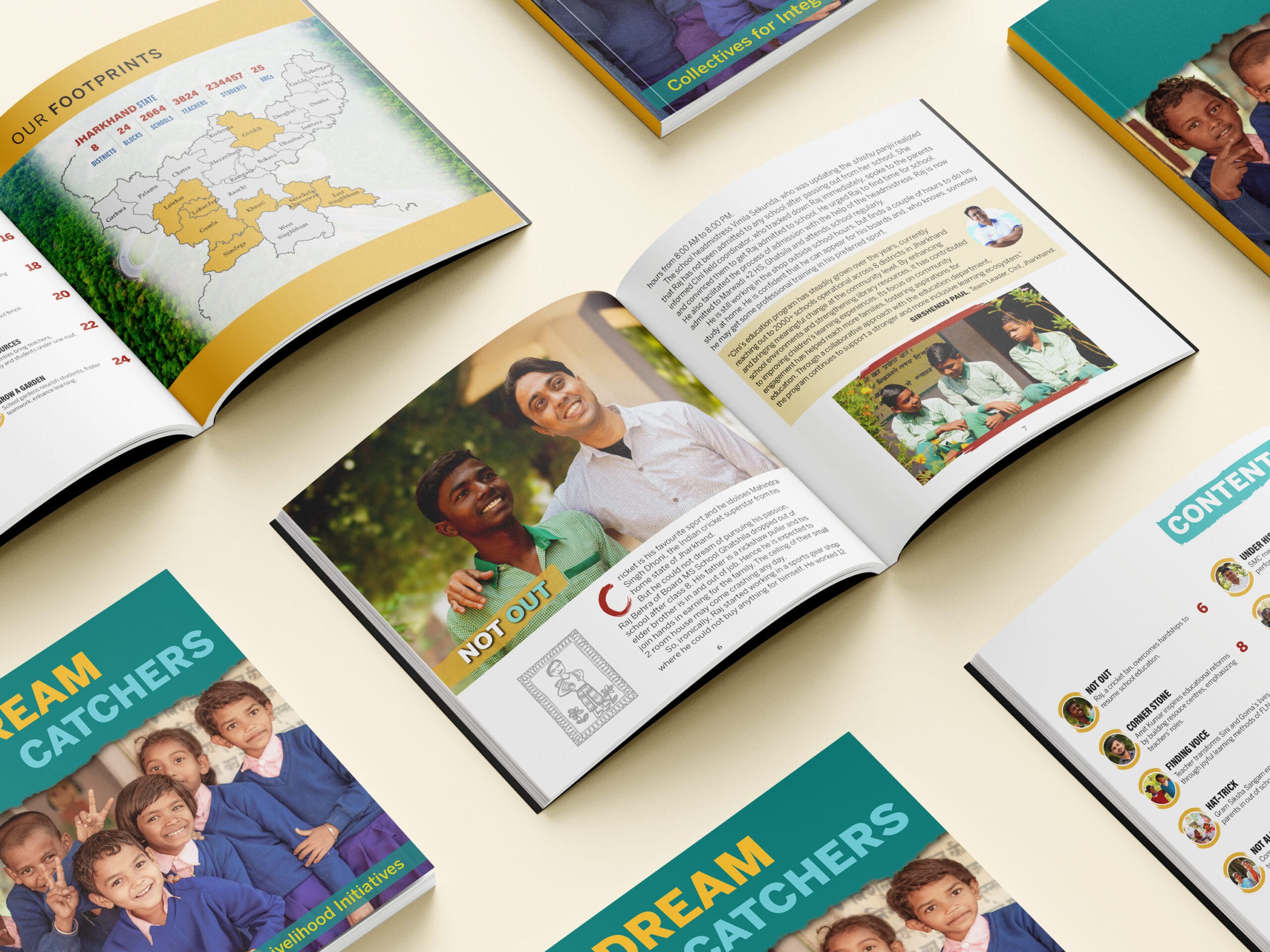
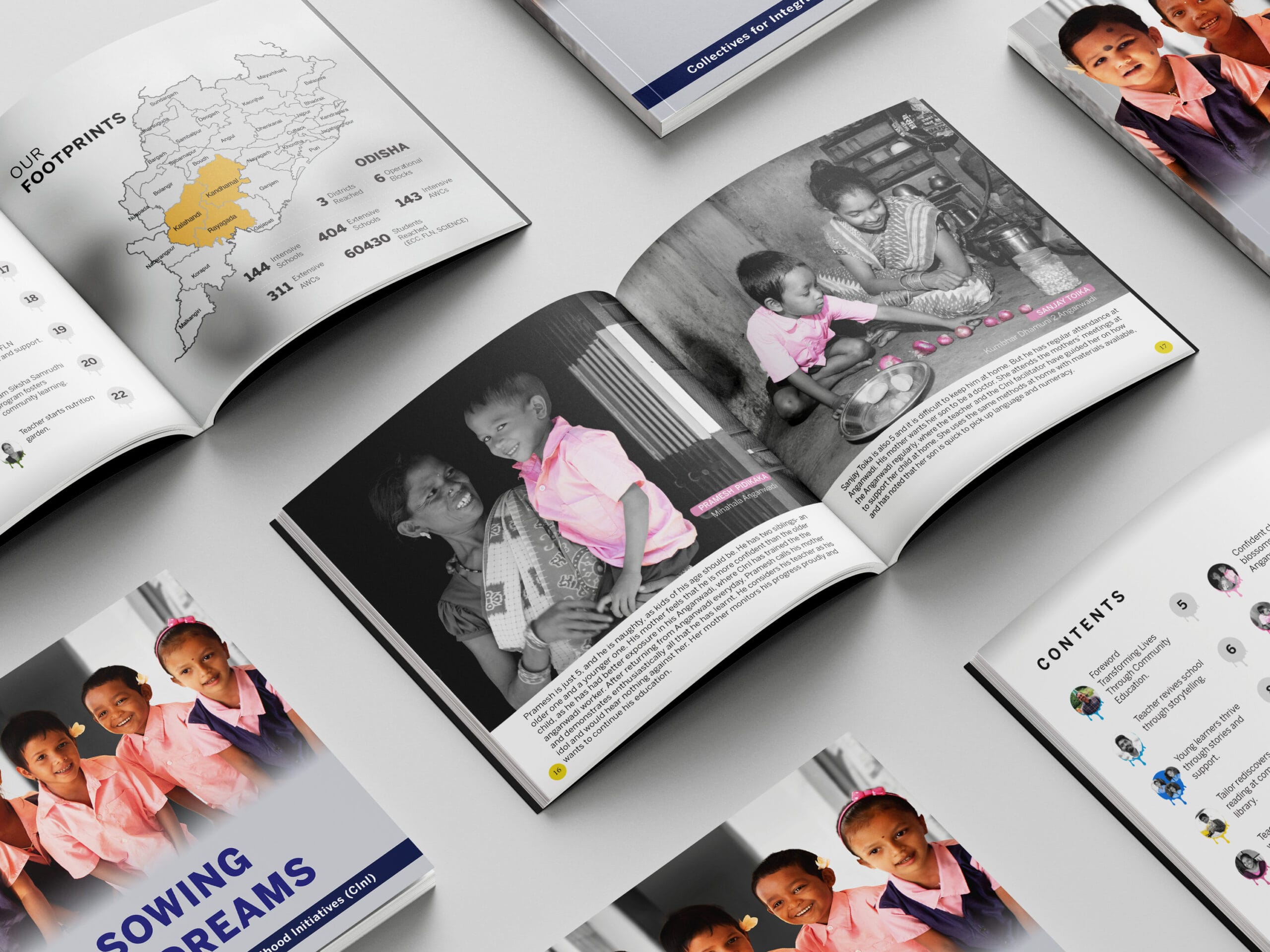
Editorial and Visual System
The design used colour as a navigation and grouping tool rather than decoration. Consistent headings, grids, spacing and programme structures helped readers move between departments while maintaining a unified institutional identity.
Complex academic content became easier to scan and compare, while the overall tone remained appropriate for a public university.
The Outcome
The final prospectus presented programmes and departments through one coherent visual language. It improved readability, information flow and institutional presentation while giving the university a practical system for communicating a large body of academic information.
The Registrar’s positive response recognised both the clarity of the finished design and the disciplined, collaborative process followed during content development.
Communication Value
This project demonstrates how public institutions can use editorial design to make complex information more accessible without oversimplifying it. The value came from combining content coordination, information hierarchy and visual design—not from decoration alone.
For universities and research institutions producing scholarly periodicals, explore our academic journal design and layout service.
I started writing down one thing at the end of every day — what I actually managed to do. Not a to-do list, not plans. Just one small win. It’s surprising how quickly it shifts your perspective.
I’ve been lately been diving into different color schemes like deep summer and soft winter to learn more about what works for my skin tone. For those questioning \”what season am I\” or seeking the best colors for pale olive skin or red undertone skin, platforms like the color analysis app can be a great resource. If you’re looking to learn more, there’s a wonderful 16 season color analysis quiz that looks beyond than the usual 4 seasons and helps identify the perfect shades, including options like the deep summer palette or soft winter palette colour analysis pro cancel subscription .
On a final note, if you’ve tried Color Analysis Pro but can’t figure out how to cancel your subscription, quite a few people have found it a bit tricky. You can usually cancel color analysis pro or color analysis pro subscription inside the app or website under account settings. It’s helpful to look at guides like \”how to cancel color analysis pro\” or \”colour analysis pro cancel subscription\” to eliminate unwanted billing. Hopefully this is useful those navigating both their color journey and subscription management!”
“I’ve recently been investigating different color palettes and noticed that knowing your season can genuinely help when deciding on clothes or makeup. For example, if you have a bold summer color season or are identifying with the soft winter palette, knowing this can point you to colors that suit fair olive skin or red undertone skin remarkably. There are some fantastic tools like the Color Analysis Pro app and complimentary color analysis quizzes online that simplify this, including a handy skin tone chart to identify your position in the 16 season color analysis test.
If you’ve used the Color Analysis Pro service but need to cancel, it’s useful to know exactly how to end your membership to avoid surprise billing (you can find detailed steps here skin tone chart ). Also, for those pondering “what season am I?” or “what is my color palette?” looking at palettes such as deep summer, soft winter, or even the dark summer color palette can truly define your best colors. This can be especially helpful for identifying the best colors for pale olive skin or yellow undertone skin, making styling decisions much more effortless.”