Transforming Admissions Communication at West Bengal State University
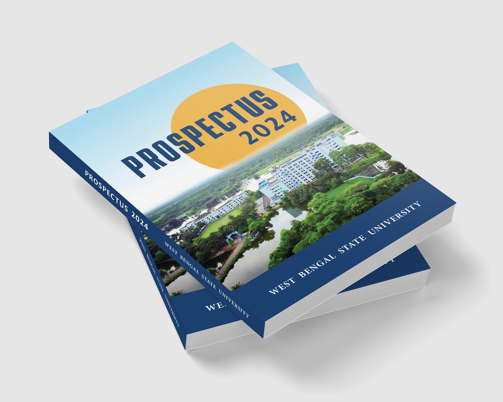
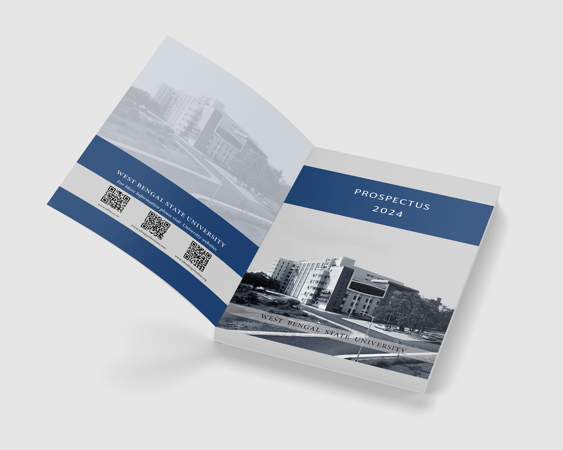
Project: Editorial Design of Postgraduate Prospectus 2024
Client: West Bengal State University, Barasat
Sector: Higher Education Communication
Service: Editorial & Information Design
The Problem
The issue was not the content itself, but how the content was communicated. Without clear structure, visual hierarchy or supportive layout, students struggled to identify what applied to them, how programs differed and what steps they needed to take. This created confusion, unnecessary stress and increased reliance on admissions staff. The publication did not reflect the university’s welcoming academic environment. Information was present, but clarity and connection were missing.
The Strategic Opportunity
We recognized that the prospectus could do more than explain courses. It could build trust, encourage confidence and reinforce the institution’s commitment to student success. The opportunity was to transform the prospectus into a communication tool that supports understanding, reduces hesitation and presents the university as approachable, organized and academically grounded. This project was not only about design. It was about improving access to education.
Design Strategy
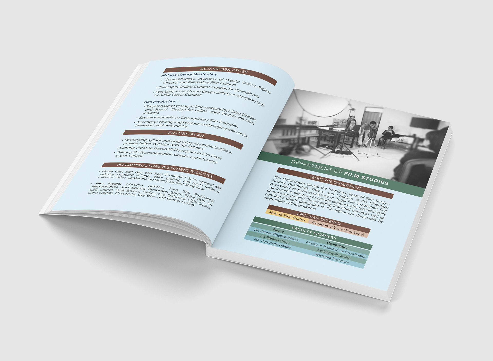
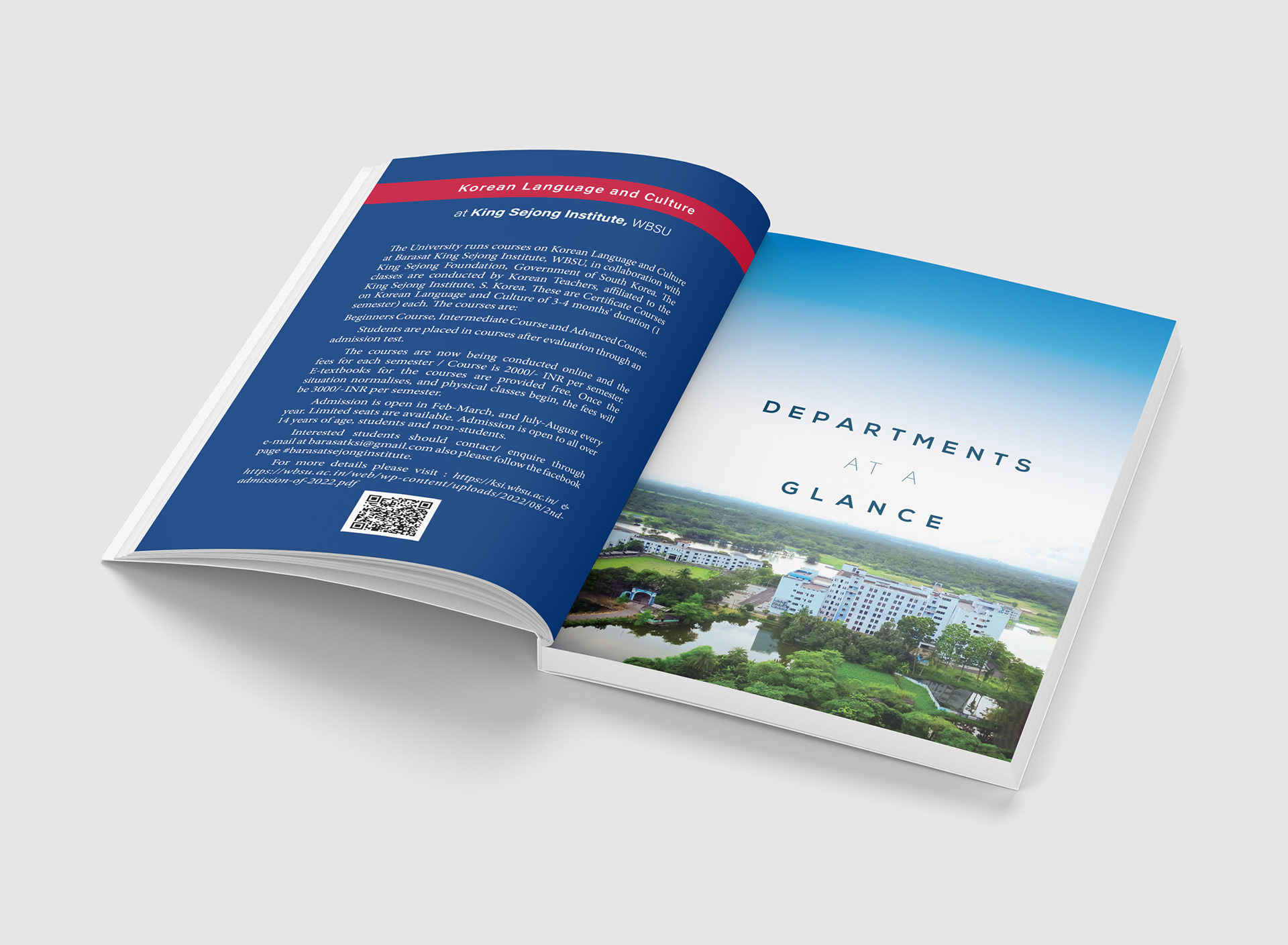
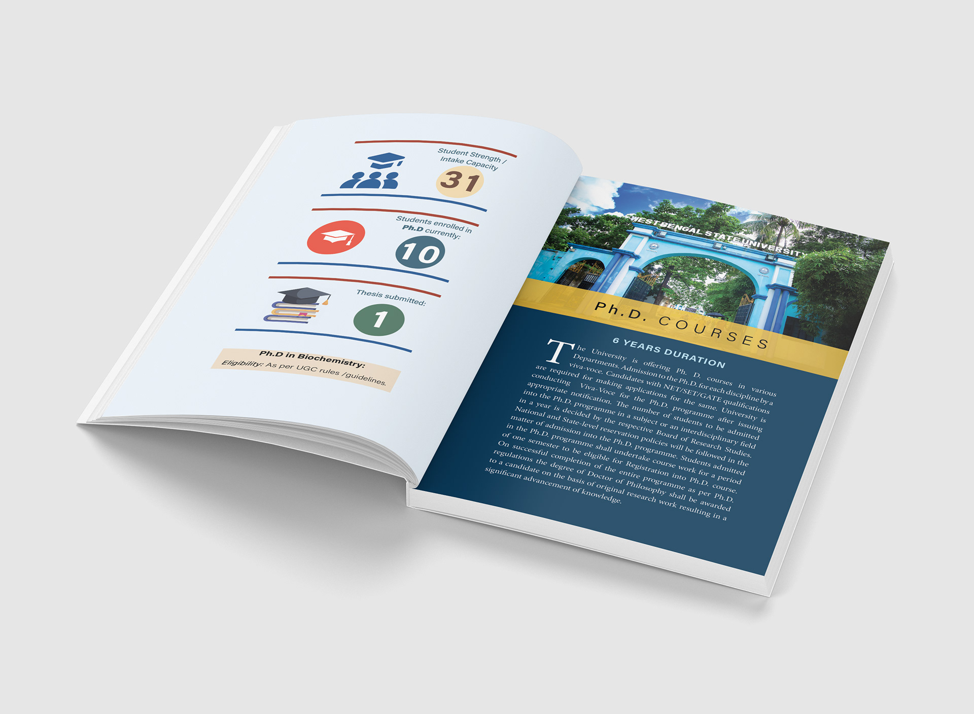
Our approach combined editorial clarity, visual ordering and human-centered communication. We restructured the document into a clear and logical reading flow, separating information into meaningful sections that guide the reader naturally. We established a consistent visual identity system built around stable typography, balanced spacing and academic colors that convey credibility and warmth. Complex data such as seat allocation, eligibility criteria and fee structures were redesigned into tables and infographic-style visuals, allowing students to interpret information quickly and confidently. We ensured the document was equally readable in print, desktop and mobile formats, recognizing how students now access official materials.
Outcome
The final prospectus feels structured, open and supportive. Students reported that they could understand program differences, eligibility requirements and application processes with ease. The admissions help desk received fewer repeated questions, demonstrating clearer comprehension. Faculty and administrative teams noted that the document now aligns with the university’s values and academic seriousness. Most importantly, students expressed a sense of confidence and welcome when planning their next steps. The publication now communicates not only information, but belonging.
Why This Matters
Educational and development-sector communication plays a critical role in shaping opportunity. When information is approachable and respectful, more students see themselves as capable of stepping forward. Good editorial design is a social tool. It promotes clarity, dignity, confidence and access. This case study reflects how Gateway Graphics supports academic and community-focused institutions in communicating with integrity, structure and care.
About Gateway Graphics
Gateway Graphics is an editorial and information design studio based in Habra, North 24 Parganas, serving clients across India. We specialize in designing prospectuses, annual reports, documentation books, training manuals and impact publications for universities, NGOs, research groups and development organizations. Our work focuses on clarity, trust and communication that connects meaningfully with diverse audiences. We believe design should not complicate understanding. Design should open it.
Work With Us
If your institution needs communication that is clear, structured and grounded in human understanding, we would be glad to collaborate.
Email: contact@gatewaygraphics.in
Location: Habra, North 24 Parganas (Serving Kolkata and India-wide)
Email: contact@gatewaygraphics.in
Location: Habra, North 24 Parganas (Serving Kolkata and India-wide)